Abas com efeito acordeão com JQuery e CSS3
Quem se dedica ao desenvolvimento web, deve ter visto com satisfação que o CSS3 abriu uma nova porta para a criação de sites com aspecto atrativo. Agora, há um mundo de novas possibilidades com o CSS3 que não era possíveis com o CSS.
Hoje, vou criar uma sistema de abas com alternância com um efieto estilo acordeão, usando jQuery e CSS. Este efeito CSS não funcionará no Internet Explorer, mas funcionará sem qualquer outro problema nos outros navegadores. É um sistema muito fácil de usar e muito atrativo em termos visuais. Eu espero que você gosto. Obrigado!
Código jQuery
$(document).ready(function(){

  $(".toggle_wraper").hide();
   $('.twitter').toggleClass("active").next().slideToggle("slow");

  $(".headings").click(function(){
    $(this).toggleClass("active").next().slideToggle("slow");
  });

});
Código HTML
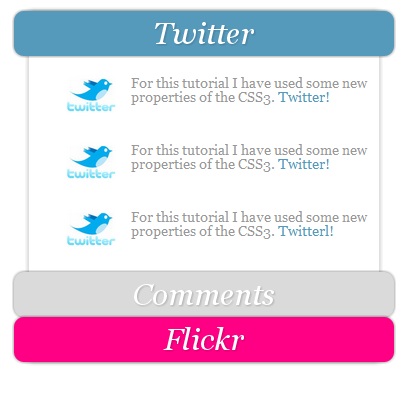
<div class="bg">
    <div class="headings twitter"><h2>Twitter</h2></div>
    <div class="toggle_wraper">

      <div class="detail">

        <p>
        <img src="tw.jpg"  width="50"  style="margin-top:0px;"/>
        For this tutorial I have used some new properties of the CSS3. <a href="http://www.twitter.com">Twitter!</a>
        </p> <br clear="all" />
        <p>
        <img src="tw.jpg"  width="50"  style="margin-top:0px;"/>
        For this tutorial I have used some new properties of the CSS3. <a href="http://www.twitter.com">Twitter!</a>
        </p>
        <br clear="all" />
        <p>
        <img src="tw.jpg"  width="50"  style="margin-top:0px;"/>
        For this tutorial I have used some new properties of the CSS3. <a href="http://www.twitter.com">Twitterl!</a>
        </p>

      </div>

    </div>

    <div class="headings wordpress"><h2>Comments</h2></div>
    <div class="toggle_wraper">

      <div class="detail">
        <p>
        <img src="wp.png"  width="50"  style="margin-top:0px;"/>
        This is nice tutorial Thanks for sharing this script... <a href="http://www.99points.info">More!</a>
        </p> <br clear="all" />
        <p>
        <img src="wp.png"  width="50"  style="margin-top:0px;"/>
        Awesome work, I like this and i am going to use it...<a href="http://www.99points.info">More!</a>
        </p>
        <br clear="all" />
        <p>
        <img src="wp.png"  width="50"  style="margin-top:0px;"/>
        I just wanna say that this is a great work here... <a href="http://www.99points.info">More!</a>
        </p>
      </div>

    </div>

    <div class="headings flickr"><h2>Flickr</h2></div>
    <div class="toggle_wraper">

      <div class="detail">
        <p>
        <img src="11.jpg" height="75" width="100"/>
        <img src="22.jpg" height="75" width="100"/>
        <img src="44.jpg" height="75" width="100"/>
        <img src="33.jpg" height="75" width="100"/>
        </p>
        <br clear="all" />
        <p style="padding-left:23px;">
          <a href="http://www.flickr.com/search/?w=all&q=cartoon&m=text#page=2">Flickr!</a>
        </p>
      </div>

    </div>
  </div>
Você pode usar mais do que 3 abas. Pode modificar o código conforme a sua necessidade.
Código CSS
body {
  line-height: 1;
}
ol, ul,h2 {
  list-style: none;
  margin: 0;
  padding: 0;
}

:focus {
  outline: 0;
}

p{ margin:0px; padding:0px;}

body {
  font-family: Georgia, Verdana, “Lucida Sans Unicode”, sans-serif;
  font-size: 12px;
  color: #999;
}

h2 {
  font-style: italic;
  font-weight: normal;
  line-height: 1.2em;
}

.toggle_wraper{ padding:0px; margin:0px;}
div#container {
  margin: 50px auto 0px auto; /* centered */
  width: 400px;
}

.bg {
  clear: both;
  margin: 0px auto;
  width: 350px;
  background: #fff;
  -moz-box-shadow: 0px 0px 8px rgba(0,0,0,0.3);
  -khtml-box-shadow: 0px 0px 8px rgba(0,0,0,0.3);
  -webkit-box-shadow: 0px 0px 8px rgba(0,0,0,0.3);
  position: relative;
  z-index: 90;
}
.twitter{background:#5599bb;}

.flickr{background:#ff0084;}

.wordpress{background:#dadada;}

.headings {

  height: 40px;
  width: 380px;
  position: relative;
  left:-15px;
  padding-top:5px;
  border: 0px #A2A2A2 solid;
  -webkit-border-radius: 10px;
  top: 0px;
  -moz-box-shadow: 0px 0px 4px rgba(0,0,0,0.55);
  -khtml-box-shadow: 0px 0px 4px rgba(0,0,0,0.55);
  -webkit-box-shadow: 0px 0px 4px rgba(0,0,0,0.55);
  z-index: 100;
}

.headings h2 {
  font-size: 30px;
  cursor:pointer;
  color: #fff;
  text-shadow: 1px 1px 2px rgba(0,0,0,0.2);
  text-align: center;
}

.detail img{ float:left; margin:15px 15px 7px 32px;}

.detail {
  padding: 0px 5px 35px 5px;
}

.detail h2 {
  font-size: 20px;
}

.detail p {
  padding-top: 19px;
  font-size: 14px;
}

.detail p a {
  color: #5599bb;
  text-decoration: none;
}

.detail p a:hover {
  text-decoration: underline;
}
Download do código usado neste tutorial: Abas Com Efeito Acordeão Com JQuery E CSS3
Fonte: Webmaster


